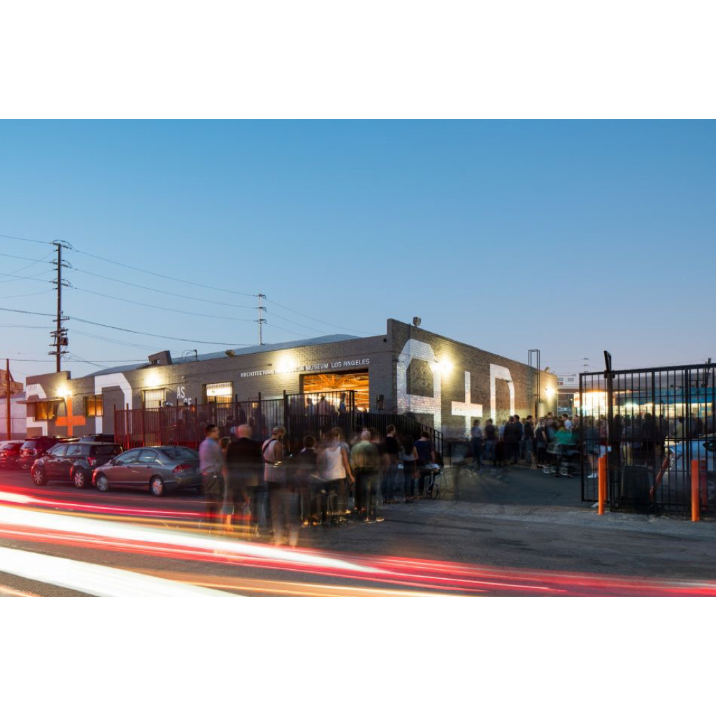
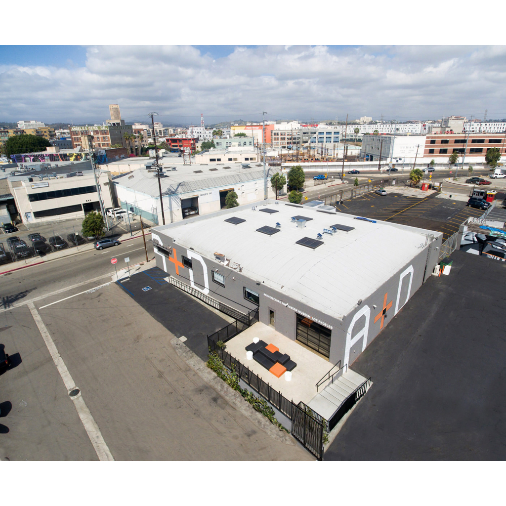
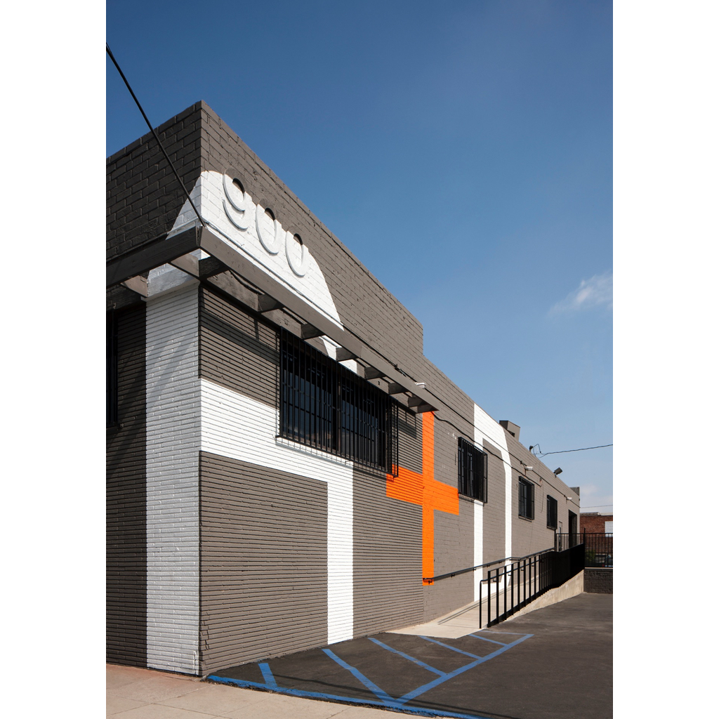
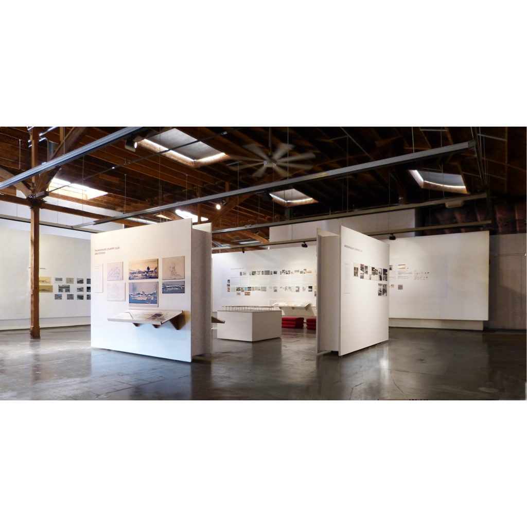
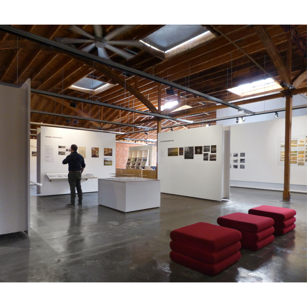
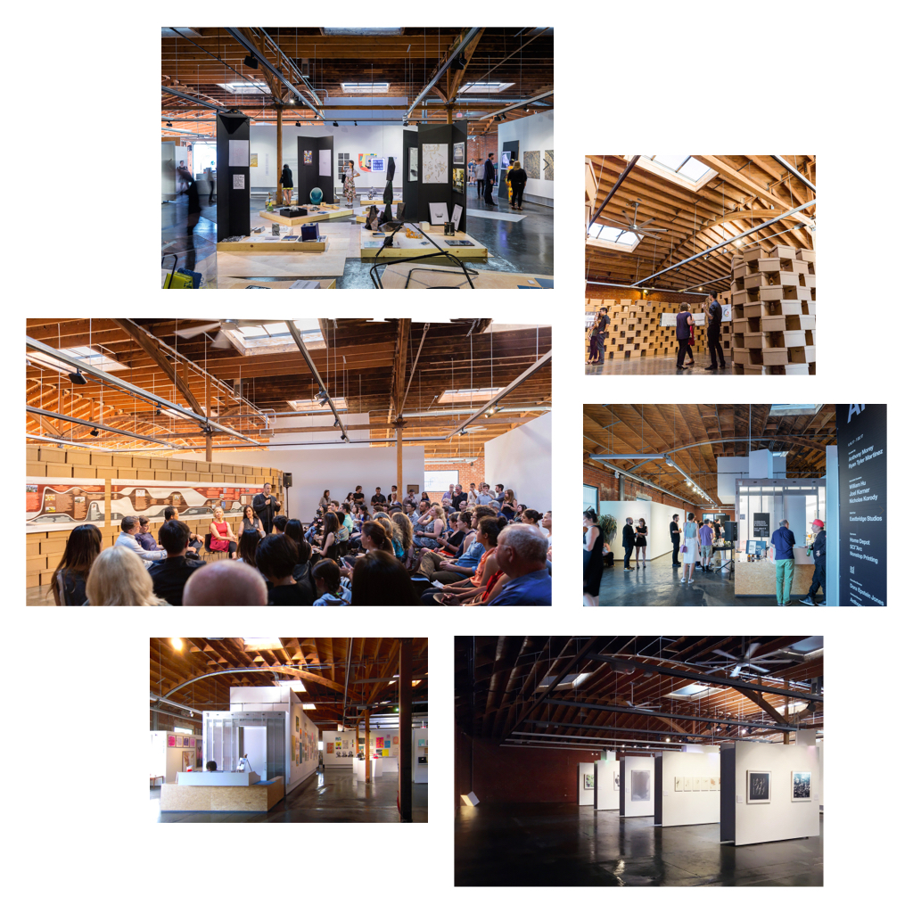
This renovation of an 8000sf cold-storage warehouse in downtown Los Angeles acknowledges its role as a background for changing exhibits while tacitly maintaining its own critical edge. Under cover of a generic “white wall” aesthetic, the design looks into details that only architects ever seems to notice.
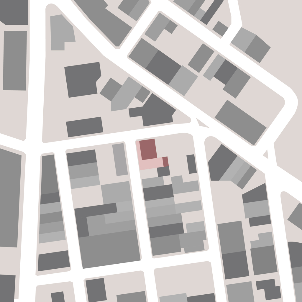
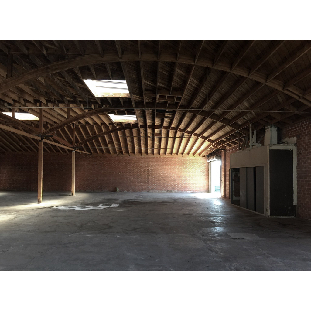
When A+D was displaced from its mid-Wilshire storefront gallery by demolition for the Metro Purple Line, the museum’s board decided to relocate to the emerging downtown Arts District. They leased a former warehouse that promised substantially increased program space and public visibility, but was literally an empty shell. I was asked to design the new fit-out, based on my previous museum experience.
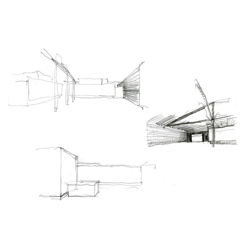
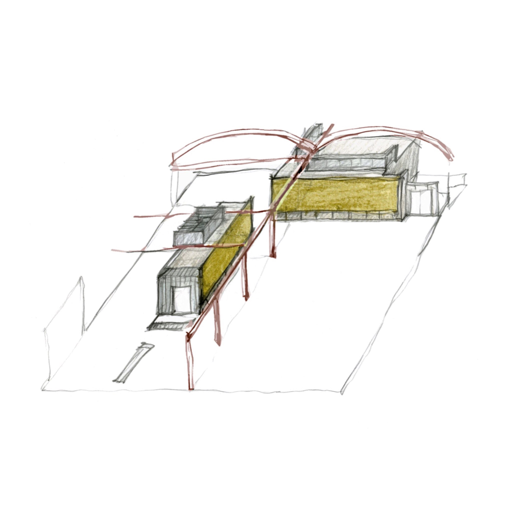
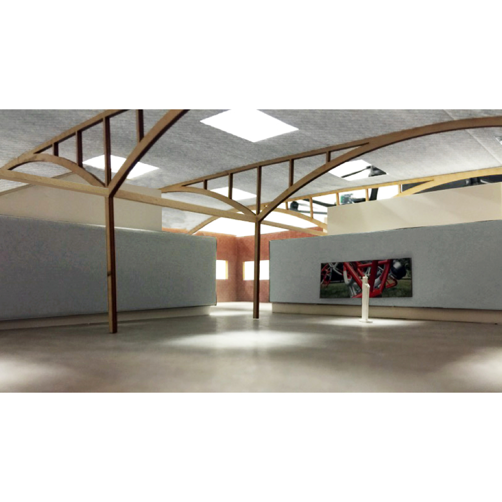
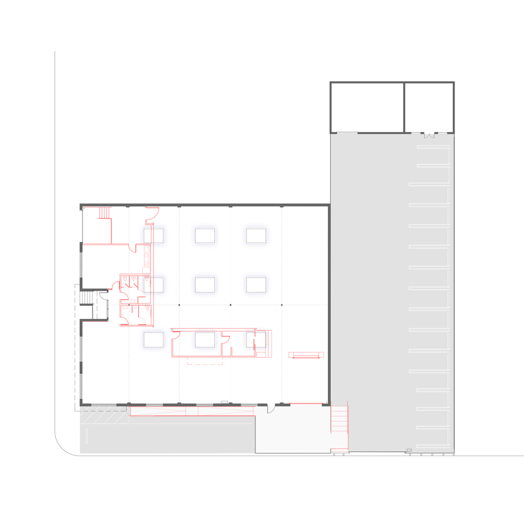
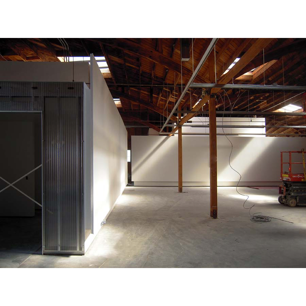
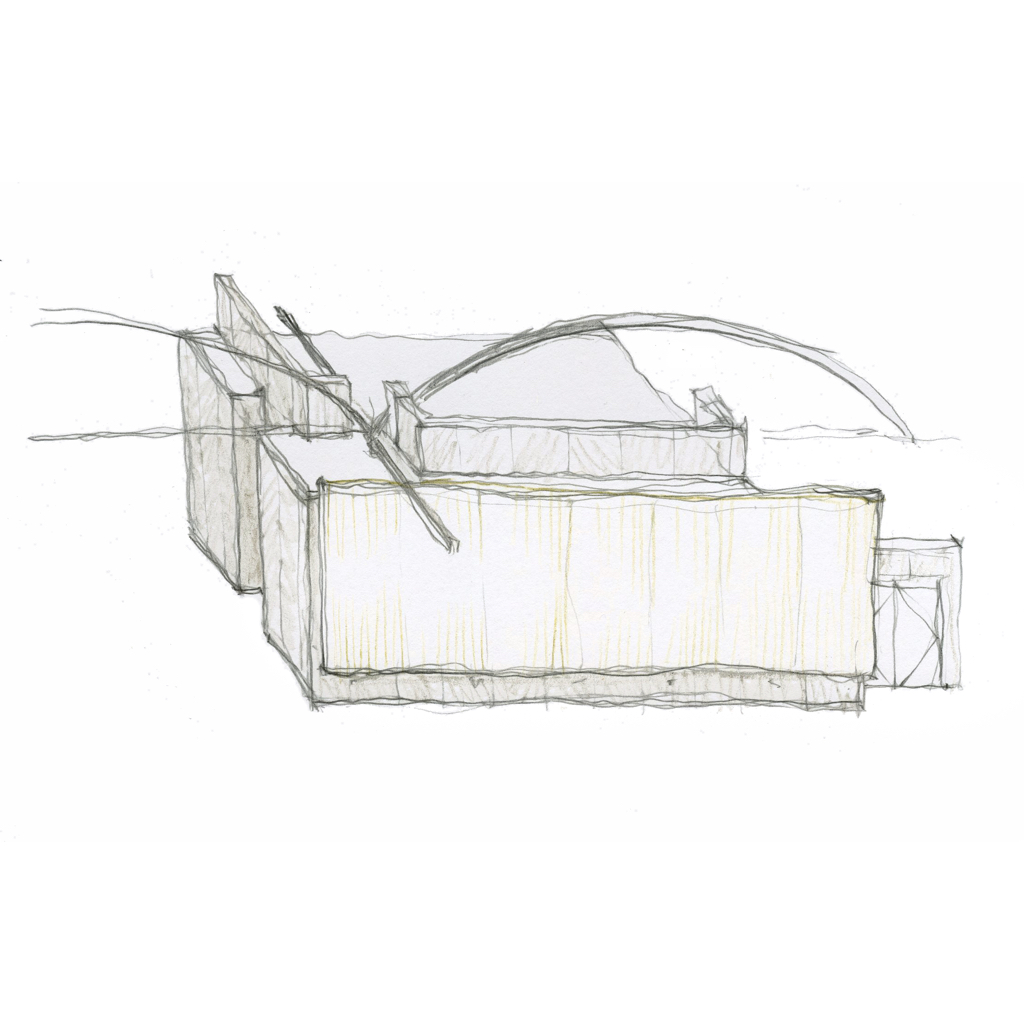
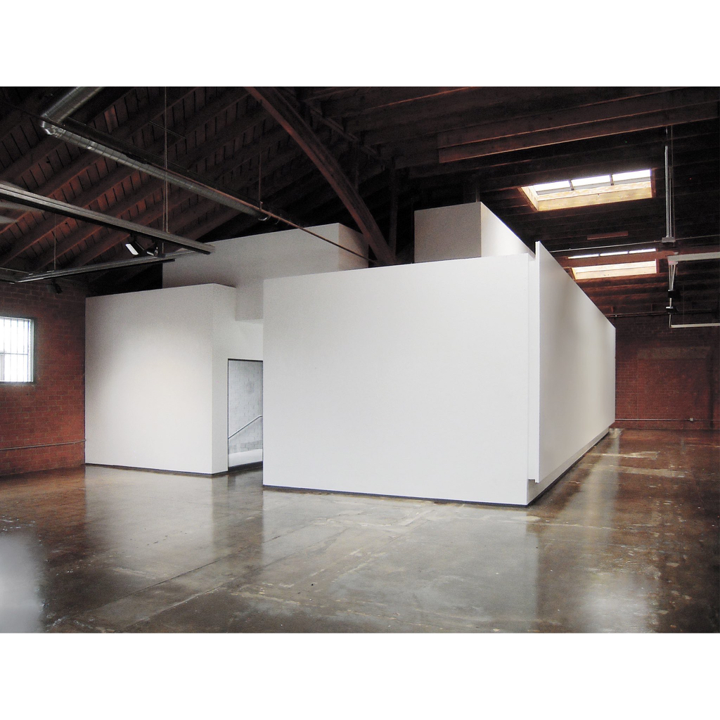
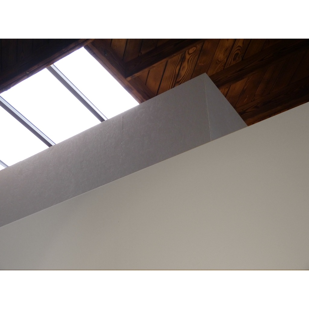
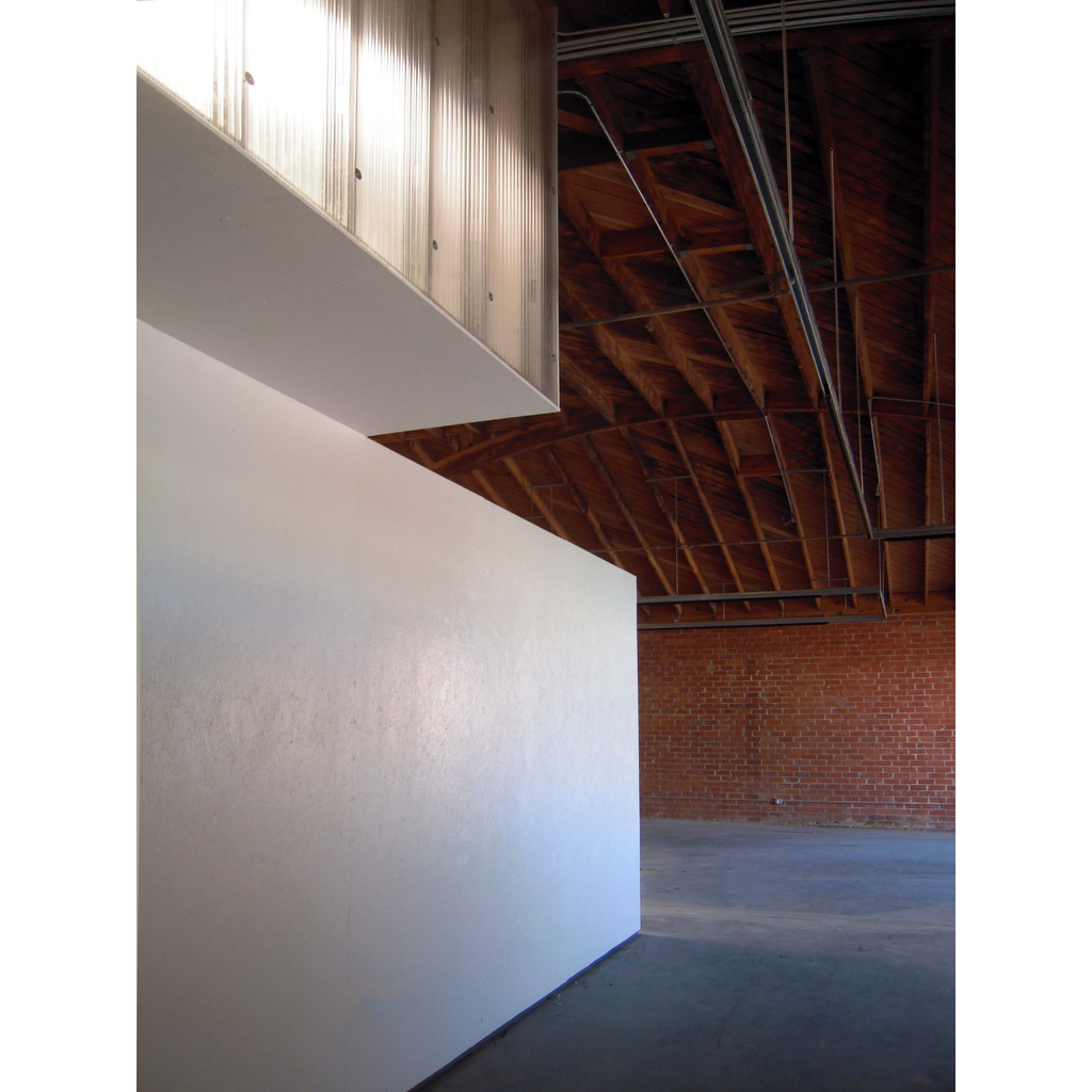
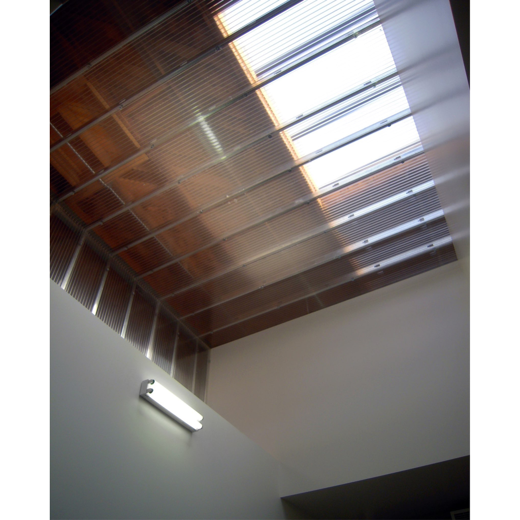
Given the available budget and the strong character of the space as found, only a few design moves were called for. The primary spaces —a 4000sf gallery and 1500sf for a retail subtenant — are simply open zones defined by two strandboard-clad enclosures containing support rooms. Cubic volumes perched on top of these enclosures for skylights and equipment screens create an overall reading somewhere between architecture and sculpture. The upper volumes are precisely positioned to slot between the existing bowstring trusses, leaving the structure visually coherent.
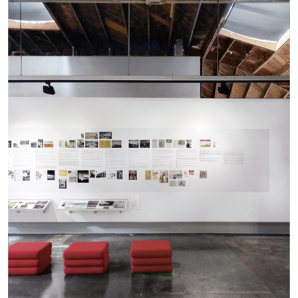
Vertical display surfaces are treated as seamless planes hovering slightly in front of the walls that support them. Electrical outlets and other devices are mounted below or behind these planes, leaving them completely available for exhibits. The strandboard volumes are painted a glossy white to bring out their texture in contrast with the smooth faces of the free-floating display surfaces.
